Satisfying
Creative Direction →
Riccardo Agostinelli
Team →
Riccardo Agostinelli, Amna Iqbal, Yaren Yavuz, Emeline Clement, Océane Pesset, Aditya Aman, Arley Cornell, Caique Oliveira, Dillan Sampaio, Gabriele Montinaro, Gino Álvarez, João Renato Nicoli, Leo Quinter, Nicholas Candeias, Paul Floc, Victor Voltz, Harvey Fisher
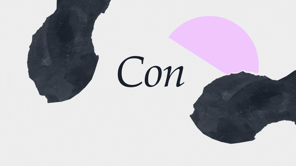
"Satisfying" is an ode to the essential elements of graphic design: shapes, typography, colors, and layouts. Each frame is a celebration of these core components, inviting the viewer into a visually captivating world where creativity and experimentation take center stage.
The objective of Satisfying was to explore the concept of aesthetic gratification through a design-driven approach. Following a research and moodboarding phase, we defined a visual direction focused on harmony, rhythm, and visual balance.

Contrast was a fundamental principle in shaping the visual language of the Satisfying project.
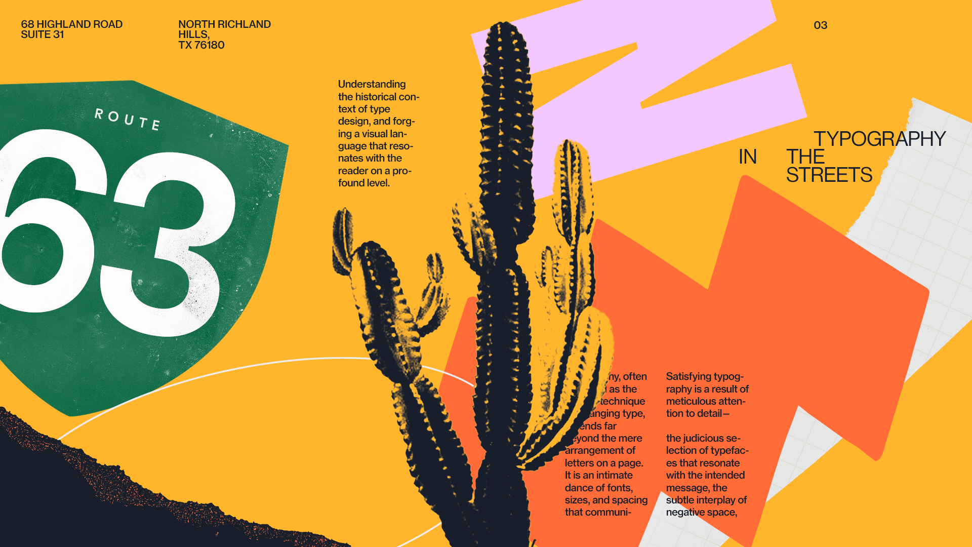

Whether through bold color pairings, scale shifts, or typographic hierarchy, contrast helped guide the viewer’s eye, enhance clarity, and evoke an immediate sensory response. By balancing opposites — soft vs. sharp, static vs. dynamic, minimal vs. detailed — we crafted visuals that feel both harmonious and stimulating.

Each motion designer was assigned one or more styleframes to bring to life, with full creative freedom over how to interpret and animate the visual elements.
The only shared guideline:
define a dynamic entry and exit transition.
This constraint allowed us to create a consistent flow across otherwise diverse animations — enabling seamless connections between different visual styles and interpretations.